The Palette of Emotions: How Colors of the Hotel`s Interior Affect the Guest`s Mental Health
By Olha Yesvandzhyia, conceptual architect at Ribas Hotels Group
Color is believed to be a powerful psychological tool that can influence a person’s emotional state. In the hotel industry, color is used to convey the mood and philosophy of the place. And in each area of the hotel, our color schemes are tailored to the atmosphere we want to create there. Discover more about color in the hotel interior design in the article below.
Color scheme for hotel areas
We customize colors to suit a particular area of the hotel. After all, it is not always appropriate to use a vivid color in a room, although this color will be perfect for the lobby. Here are some general guidelines for the color scheme of particular areas of the hotel.
- Room. I think you should avoid overly active colors that can stimulate the psyche in a hotel room, as in any place intended for rest. For example, yellow or bright green should not be used. We opt for calm color tones such as pastel and natural shades; these can sometimes be white walls with wooden touches or fabrics that add some warmth and coziness.
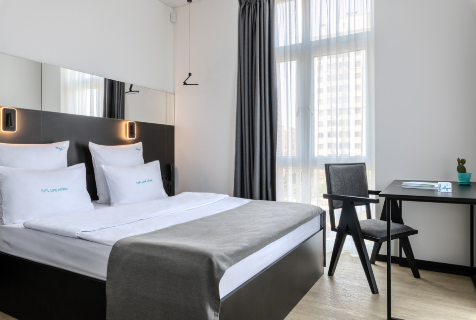
Pictured: Aparthotel WOL.121 (Odesa).
- Lobby. Brighter colors can be used in lobbies, coworking spaces and corridors. For example, an accent yellow wall will be particularly effective near a work area or in a conference room, as yellow is an energizing color.
- Spa. In this area, you should use gentle colors that do not have a negative effect on the psyche. So you should definitely not use red here, but rather blue, light green, white, beige and the like.
- Restaurant. Restaurants can look very different. Everything depends on the concept and location, and the cuisine that will be served there, plus the additional features of the place. No limits to your imagination here!
The colors in a hotel can also emphasize its concept. For example, our WOL Home+Hotel aparthotel brand targets active young people, entrepreneurs and bloggers. The colors here are bright and vivid – red, blue and others. They are both vibrant and energizing.
In five-star hotels, the color palette can be more pastel and deeper. This is a way to create a luxury feel. Natural tones and shades that mimic nature can also be used.
When it comes to hotels in the mountains, you can keep colors as neutral as possible: large windows and white interiors will let you enjoy the view.
How location affects the color scheme
We choose colors according to the hotel’s location. First, these facilities are in line with the architecture of the area, and second, they become a reflection and a certain complement to the natural environment. For example, hotels in the Carpathians mostly prioritize wood and warm color tones with green shades. On the other hand, in hotels by the sea, you will find blue and delicate color shades reminiscent of sea waves.
Here’s an example. We have 5 projects in Bali, the style of which is much different from what we have in Ukraine. The main feature is the natural atmosphere. Some projects are designed in the Balinese style, which involves the predominant use of wood and bamboo, lots of greenery and neutral colors. The walls are usually beige or white. High ceilings with beams and exquisite patterns, curtains, greenery, open bathrooms and showers are all characteristic of Bali.
Hotels that are being built in Bali, even when they don’t use the Balinese style, still have similar elements, because they mostly use local materials. Bali even offers an eco-initiative that encourages the purchase of local materials. Apart from supporting the local economy, this has a positive environmental effect on the planet through reduced transportation emissions.
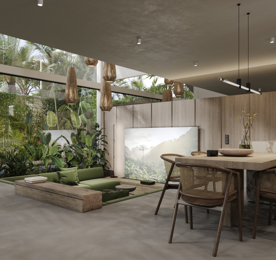
Visualized: Moon Rock villas project (Bali).
We also designed a hotel in the mountains in Italy. The situation there is the same: the buildings are visually very similar, because they are made of local stone; you can find light beige facades and local painting, which is rather colorful.
How colors work in conjunction with light
Today, lighting has become not only a trend, but also an integral part of design. Lighting can use lenses and color schemes where shades blend seamlessly into each other. Light significantly affects the atmosphere and well-being of guests in the room, along with photogenicity and visual effect. Lighting can modify any color, so this aspect should be considered when designing. You can accentuate the color by using light where necessary, and you can neutralize the effect of the color elsewhere.
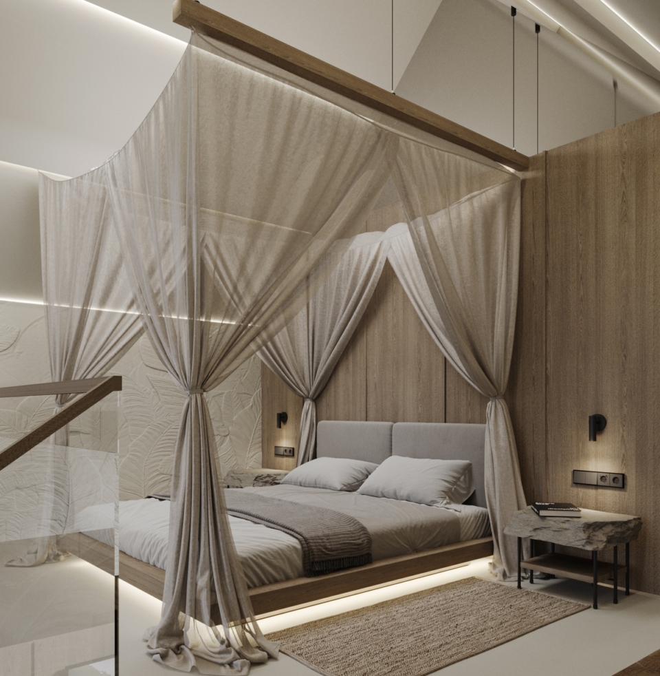
Visualized: Moon Rock villas project (Bali).
For example, in one of the hotels we are working on, we are planning to use colored lamps, which will create an Instagram-like effect and a special atmosphere. We also considered using light interiors and adding pink lighting to emphasize the hotel’s corporate identity.
When designing facade lighting in the Carpathians, we made the most of associations with local surroundings. For example, for a ski resort, warm lighting creates a homey atmosphere associated with the coziness and warmth of a fireplace.
Hotel coloring is not just about trends and “instagrammability”. It is about the psychology of color, the concept, and the location. What’s more, you should not know forget inclusiveness. Given the current situation in the country, we do not recommend using colors that can negatively affect people with psychological trauma. The effect of colors on people with post-traumatic stress disorder is now being extensively studied, and this topic is more relevant for medical institutions. However, this should also be considered in hotels that are focused on rehabilitation and recovery.
Developing a hotel design project with Ribas Hotels Group. For more details, follow the link.
Subscribe to our blog to keep up with trends on the hotel real estate market!


